


The Wrong Weather
Creative Production and the Collapse of Symbolic Architecture

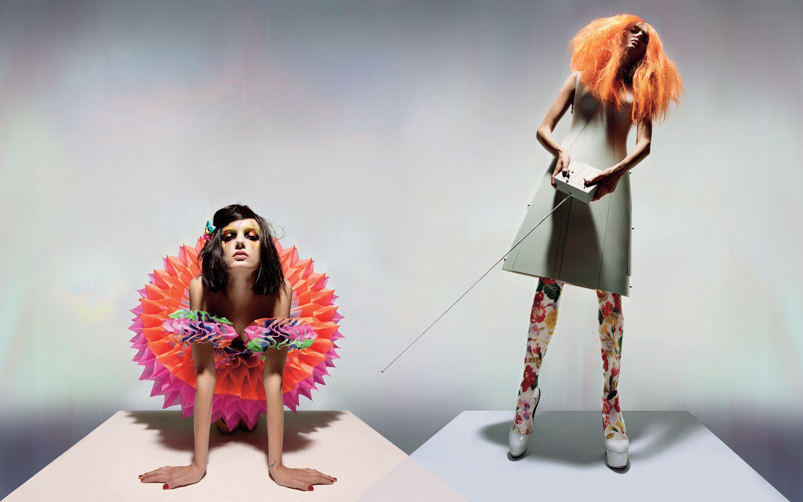
There are perfume ads that cost more than most indie films. A model runs down a marble hallway in slow motion, a flock of CGI doves erupts from the shadows, and light delicately filters through fake dust particles. It looks like prestige cinema but you can’t quite remember what it was for, and even if you could, it wouldn’t really matter. Campaign after campaign have the production value of Marvel set pieces and the cultural imprint of a looping video at the duty-free section at the airport.

Design gets shinier and strategy gets louder, but nothing lands. Which is odd, because people know what they want, or more accurately, they know what they’re supposed to want, but they don’t know where they are anymore. Everything just kind of floats, looking expensive, well-lit and feeling airless.
There's a misunderstanding of creative direction and creative vision, as styling, or aesthetic assembly. Where, if you can match the serif font to a washed-out color palette, add some film grain, that you can call that a world. It’s not. That’s much closer to signage, there’s no real structure there, just pure signal. The substance of concept development has been boiled off, and distilled into a line in a job description. Careers have been built on looting the same prefab catalog of visual cues, stories and references, rearranged just enough to feign authorship.
But the deeper issue is displacement. Branding, as a concept, as a practice, has become epistemologically broken. Symbols are treated like stickers, rather than the scaffolding that they are. Gestures to what is real have been replaced with actual movement. When the work doesn’t know what it’s reorganizing, it ends up performing relevance while erasing context and what we’re left with is symbolic gloss.
Real creative work maps a world, and shows us how to see, hear, feel, in ways we hadn’t even conceived of.
Symbolic Gravity and the Production of Space
Carl Jung, writing nearly a century ago, understood that the psyche is not a blank slate (or forgive me, a Tabula Rasa) but a structured landscape. It is carved by archetypes, populated by shadows and flooded with inherited dreams. The collective unconscious isn’t simply a shared archive of symbols, it is more like a constantly shifting topography. A kind of mythic geology that shapes how meaning feels before it’s even articulated. In Jungian terms, creative work doesn’t merely communicate, but it orients. The images activate myth, and myth is spatial.


When the importance of this orientation function is ignored, there is a palpable flattening. Creative work tends to skim along the surface and novelty is confused and mixed up with resonance. The psychic charge that gives a work cultural memory is no longer within reach, and meaning begins to drift. The work becomes hyper-legible like we’ve discussed in previous articles, but it is rendered completely inert. Jung might say here that, it becomes unmoored from the archetype, and slips into shadow, where it no longer expresses anything directly, mirroring anxieties it can’t metabolize.
This is what creative direction at its best can do. When it's working, it doesn't just position you within a cultural moment. It orients you within a symbolic ecosystem. You don’t just “see” it, you dream with it.
Henri Lefebvre’s “production of space” is a diagnosis. Every ad, interface, billboard, app, and capsule collection doesn’t merely occupy space, but it produces it as well. Not physically of course, but symbolically. Through language, ritual, and representation. Space gets codified as cultural, emotional, mythic.
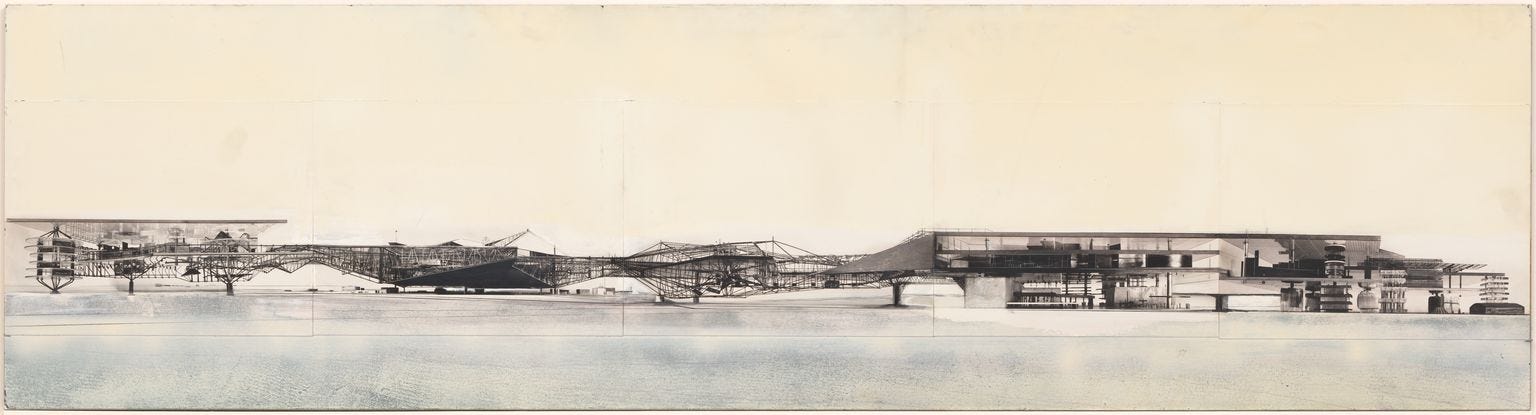
Deleuze and Guattari add friction. They distinguish between smooth space which is open, continuous and unmapped, and striated space, where movement is controlled by grids and borders. A tracing is striated, but a map is smooth. And so much of the branding work we see today is much closer to this notion of tracing. Pre-striated. It copies coordinates that worked before and lays them back down like carbon paper.
Mapping, by contrast, generates terrain. It draws new borders. It doesn’t say “make it look like this.” It asks “what kind of place does this need to be?”
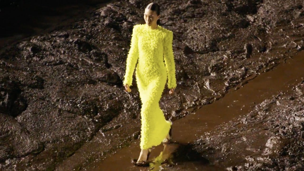
This is what good creative direction and a well-developed vision can do. It can produce gravity just as much as it produces aesthetic. You know the symbolic mass of work like this when you feel it, even if you hate it, or if it makes you uncomfortable. That uncanny sense that the work knows its own myth. Like Raf Simons’ early Dior shows, Burial’s South London, or like early, Tumblr-era Hood By Air where the world wasn’t coherent, but it was saturated. Like Playboi Carti’s blown-out mixes and emergent sacred geometries. Not sleek, or clean per-se, but charged.

Or, take Addison Rae. Once dismissed as TikTok’s algorithm-made mascot, she has delicately and expertly maneuvered herself into strange and sticky cultural territory by stepping sideways into ambiguity. Her Diet Pepsi short, directed by Sean Price Williams and styled by Mel Ottenberg was a sort of smeared and haunted artifact, less commercial than it was spectral. The one clip of her in a supermarket, backlit and uncanny, didn’t quote Anger or Cassavetes, but it placed her in a lineage of subcultural visual language. She stopped styling herself like a product and started occupying space. Each collaboration, Arca, Charli and Petra Collins, were geographic moves through the terrain of culture, sound and our contemporary landscape. She moved through new zones and entered new symbolic gravity wells. However you feel about the outcome, this was a complete conceptual relocation of her image in the collective consciousness.

Symbolic gravity doesn’t come from polish, but from placement.
Most Work Doesn’t Map.
I think that too much creative work today gets mistaken for architecture when it’s actually cafeteria service. We add a little Brutalism here and a bit of Y2K there, sprinkle in a serif logo that says “serious” and a pastel gradient that says “safe,” and what we end up with is modular, legible, and completely adrift.
A menu is what you hand to someone you don’t trust but a map makes you accountable for finding your way through the actual terrain.
Look at the endless graveyard of DTC brands that launched with perfect typography and died without a sound. Or every new AI productivity tool that looks like it was designed by someone who hasn’t left a WeWork in four years. There’s no symbolic commitment or grounding.
Even legacy institutions are chasing trend vapor. Balenciaga’s 2022 meltdown could be considered more of a spatial crisis where they refused to update the terrain. It kept zooming in on the same detritus of irony until the whole grid buckled. You can’t stay uncanny forever without recoding the map.
“Brand cohesion” is a losing game when your references have no mass. You end up with symbolic landfill. Brand soup. Aesthetic paste that dries on contact. Creative direction is about making references hold together under pressure as much as it’s about making them align.
Mapping As Method
What gets missed a lot is that when you don’t map, and when you just collage references and pray for coherence, you leave your work vulnerable, which is arguably much worse than the more obvious crime of the work being completely forgettable. Symbolic drift invites parasitism. Without grounding and an understanding of the territory, the work becomes a vacant structure waiting to be squatted by trend-chasers, scammers, and platforms looking for cultural clout. Without anchoring, even your best ideas get misread, flattened, or absorbed into someone else’s narrative.
Being ignored seems trivial when the real risk is being harvested. Cultural entropy begins with a failure of orientation.
Mapping is a slow, painful and often embarrassing process. You commit to references before they’re fashionable. You align with collaborators who make things more difficult, but also more dimensional, and you turn down obvious opportunities because they move you sideways, not forward.
Imagine a project built from the idea of "residue." Not a theme or a place, but a kind of humidity. The artwork won't be clean, the typography won't sit on grids and the press rollout avoids the usual genre tags entirely. Here the music can transcend its conventional place as product and become the terrain. Everything else surrounding it must feel like it comes from inside of that weather system. Even if it’s the wrong weather, at least you know where you stand.
This is what spatial logic enables. Worlds that behave and repel the wrong types of attention. Worlds that nourish the right audience slowly, unevenly and with the right amount of friction. Because terrain takes time to take shape, and friction is what makes it hold.
Take a piece of creative work you admire. Not just an ad or a rollout campaign, but a whole system, and try to chart its coordinates. Not what it looks like, but where it places you. What types of spaces does it open? What references does it refuse? What kinds of people, feelings, or futures does it naturally repel? Instead of asking how it was made, ask what kind of world it assumes you already live in.
If that world feels a little unfamiliar, good. It means the map is starting to work.
Jozef White is a strategist, consultant, and freelance philosopher working across music, technology, and culture. He is the founder of The Tabula Rasa Record Company, Maison Blanc, and Inscripta, and works with artists, labels, startups, and other organizations on their creative direction and product strategy.
Find him on LinkedIn and Instagram, or get in touch via email to discuss projects, collaborations, or consulting opportunities. Visit tabularasarecords.com to learn more about Tabula Rasa.
Amazing stuff again mate. One of the best writers here - no doubt. What a treat to bounce between the labels output, and your writing.
This was a tougher piece to digest, but as I chew through it, it's making me consider ways I can incorporate more symbolic commitment in my creative output, and contemplate where my creative work orients the consumer/listener/audience.